Bridging the Gap: Creating a Scalable Multi-Brand Design System for Enterprise Products
Office of Information Services
University of Washington
Role: UX design and design operations, building alignment across teams and guiding adoption
Team: Developers, UX team, Business Analysts, & Product Owners
Tools: Figma, Confluence
Background
When I joined the UW Office of Research team, I inherited a Figma design library that contained colors, fonts, and a couple of patterns that served one of our two enterprise products. It was used more for simple Figma prototyping than as a true design system. I saw an opportunity to create a scalable, multi-brand design system that would not only enhance consistency across our products but also improve collaboration and efficiency between UX, business analysts, front-end developers.
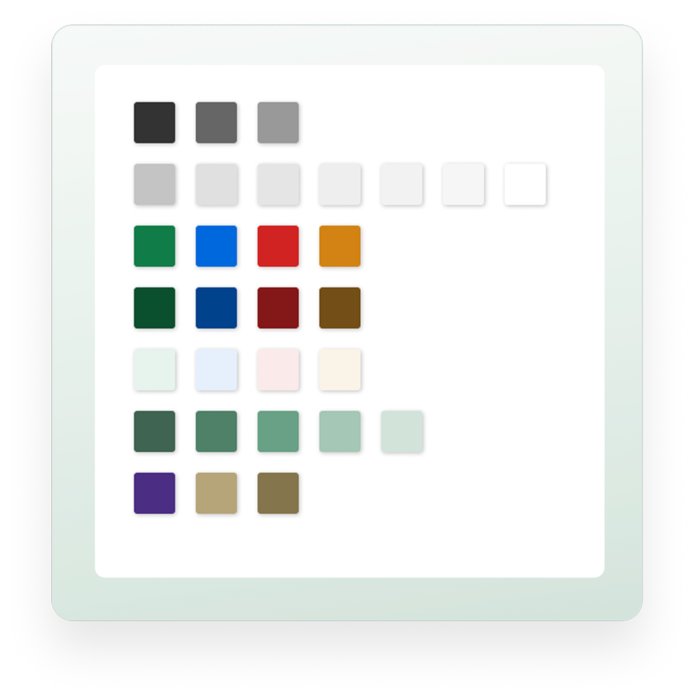
Example of the color section in the Figma design library
Problem
Lack of alignment and documentation created a disconnect for users and an operational burden for our teams.
SAGE had no complete catalog of patterns. As a designer, I often found myself searching for existing patterns in obscure system states or, worse, redesigning components that already existed.
We were also working on a new feature in MyResearch that would bridge users between our two products. There were different UI patterns between the two systems, branding challenges, and usability issues for users simultaneously navigating MyResearch and SAGE.
Solution
To address these issues, I led the effort to design and implement a consistent, scalable multi-brand design system that:
- Bridged a seamless user experience between both products.
- Reduced inefficiencies by providing a single source of truth for designers and developers.
- Established clear guidelines for why, when, and how patterns should be used.
- Standardized components across products to simplify development and maintenance.
- Established guiding design principles to drive consistency and encourage better decision-making.
Project Outline
Duration: Iteratively over 1 year

Understand
Collected & audited existing pattern libraries
Gathered stakeholder pain points
Audited SAGE & MyResearch patterns
Conducted accessibility audit
Utilized heuristics evaluation
Investigated Google Analytics
Create
Collaborated with product team members
Expanded Figma component library
Created Figma variant + component naming conventions
Applied accessibility and universal design principles
Planned implementation of design improvements
Validate
Elicited product team and leadership feedback
Gained product team and leadership buy in
Iterate
Conducted demos, working sessions, and phased implementation
Applied team feedback
Balanced usability, feasibility, and scalability
Houston, We Have a Problem
While working on my first set of UXD projects for the SAGE enterprise system, I began to find limited design documentation. Even with spending too much time triggering different states to uncover decades of patterns, I still couldn’t catch them all. I’d spend time designing patterns that already existed and review them with the BA and FE team, all to hear frustration over reinventing the wheel. I don’t blame them!
Additionally, I started working on the MyResearch application. As I started to get a lay of the land, I found that no two buttons had the same style. Additionally, this product was getting a new feature that would bridge users between MyResearch and SAGE.
And that’s where ideas for areas for improvement started.
Step 1: Audit & Analysis
1. 2. 3.

I conducted a thorough audit of our existing design and pattern landscape by:
- Collecting assets from the limited Figma library and front-end Storybook components.
- Auditing both SAGE and MyResearch enterprise systems to document inconsistencies.
- Conducting an accessibility and usability audit to identify issues, including WCAG 2.1 AA failures and poor affordance for key actions.
- Reviewing Google Analytics data for screen sizes and mobile usage patterns.
- Leveraging our UX research team’s recent heuristic evaluation.
- Facilitating info sessions with leadership to understand overall product suite goals.
Key Findings
Accessibility gaps
Some color contrast, font sizes, and button targets failed WCAG 2.1 AA guidelines.
Unclear pattern definitions and usage
In addition to SAGE’s missing documentation of patterns with a simple design system, there was a StoryBook library that had missing components and broke often. MyResearch had no documentation and had inconsistent patterns across all sections of the app.
Lack of alignment with leadership’s vision
The broader goal of a cohesive product suite was not reflected in the current UIs, resulting in mixed experience for users using both products together.
Original Figma library with no documentation and inconsistent button styles in UI
Step 2: Building the Multi-Brand Design System
1. 2. 3.
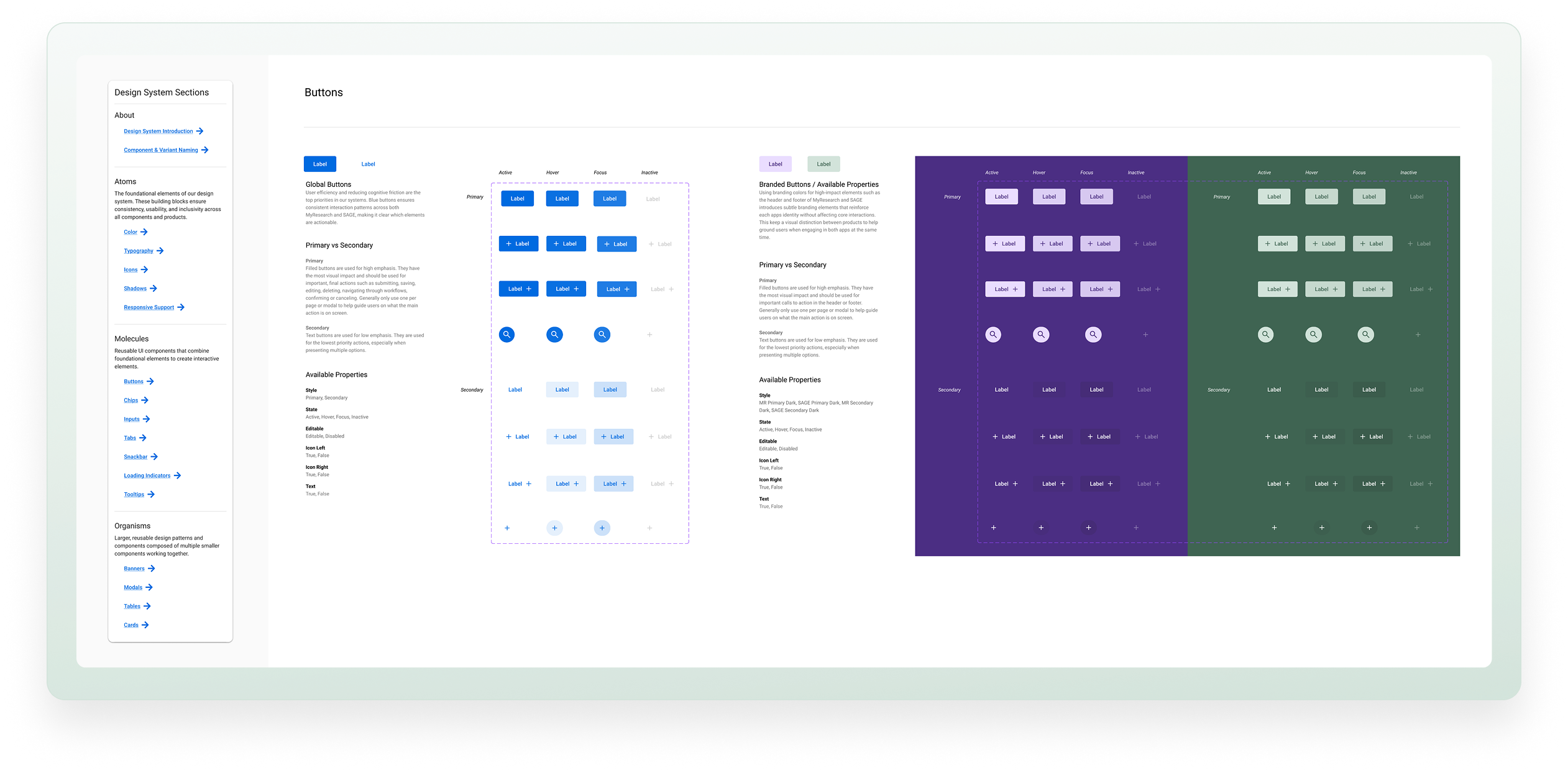
Standardized usage of core UI elements and components
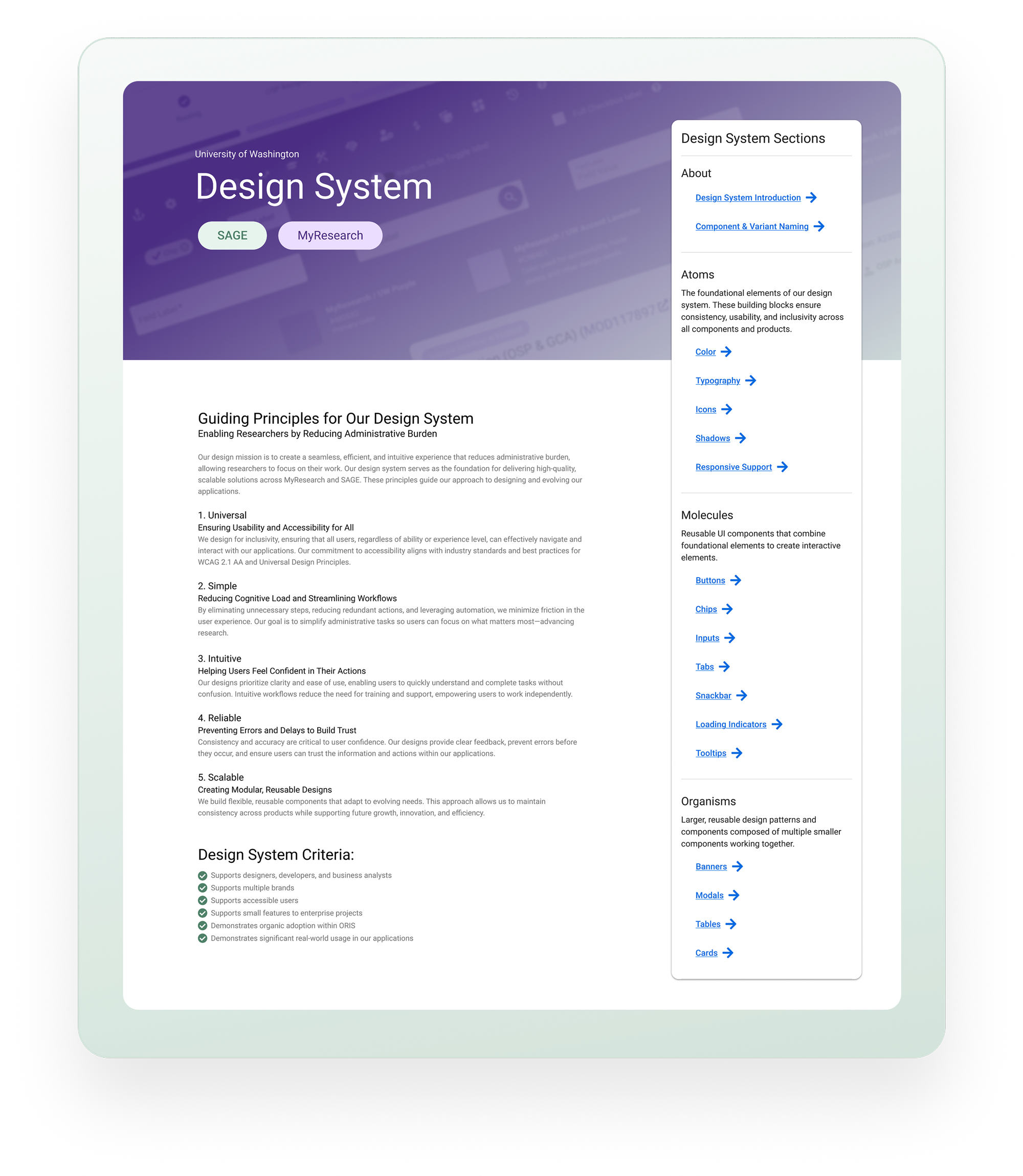
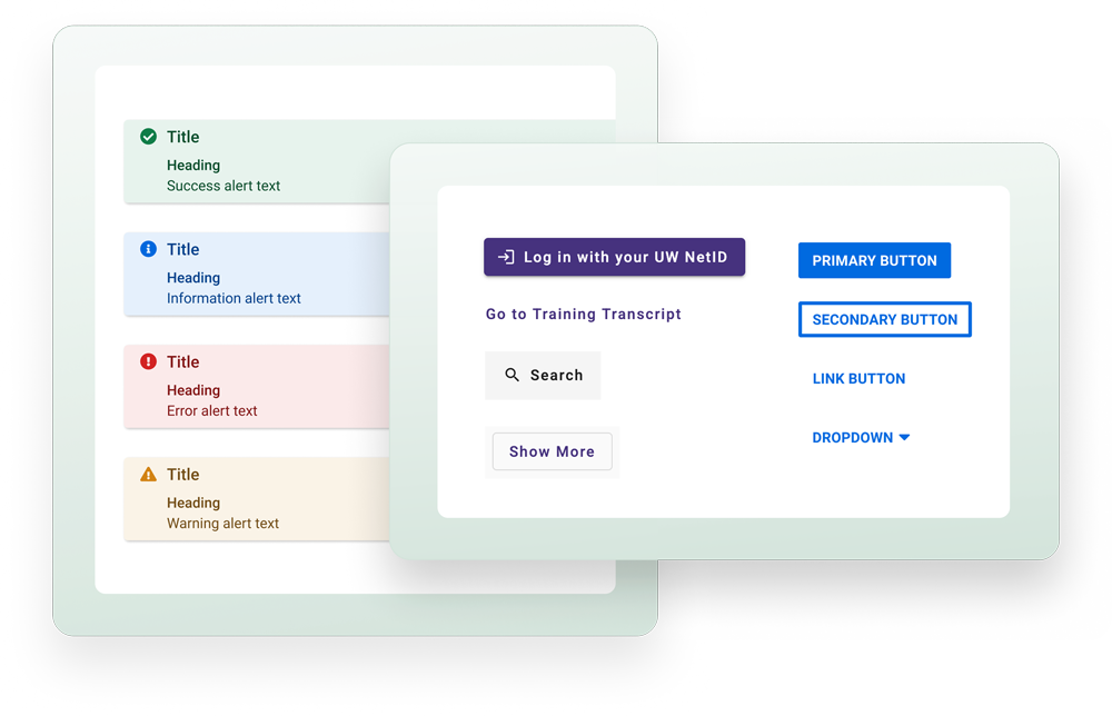
I created clear pattern definitions and documentation, ensuring consistency across products. I strategically maintained brand differentiation between SAGE and MyResearch such as headers, footers and the welcome experience to help anchor users to the application. However, I created consistency and predictability with global key interactions, status colors, iconography, typography, and navigation, creating efficiency and reducing cognitive friction.
Prioritized accessibility fixes
With the April 2026 accessibility deadline of WCAG 2.1 AA a year away, I took the time to focus integrating new accessibility improvements into our sprint cycles in both SAGE and MyResearch that coincided with new feature work.
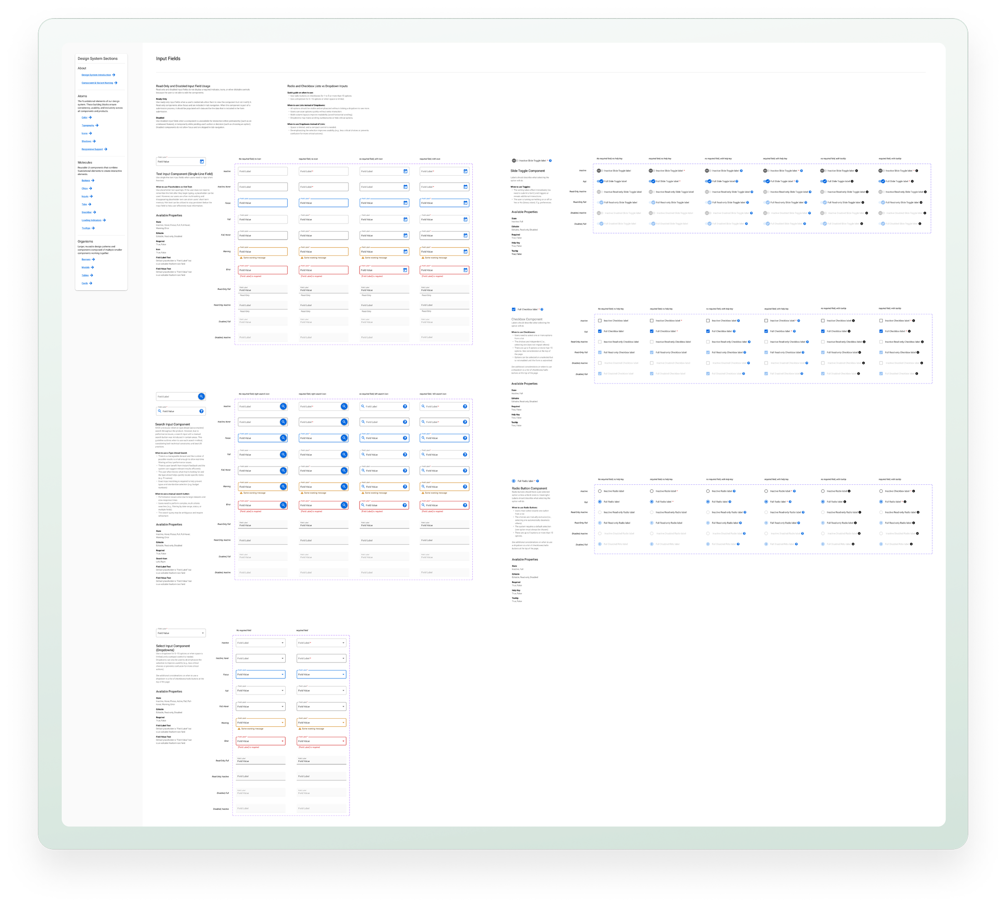
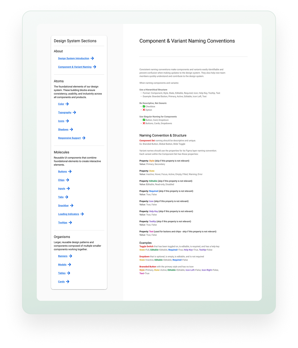
Improved workflow for the UX team, building a robust variant structure in Figma
This allows designers to quickly prototype different states of components and created clear guidance for how to structure variants in the design system for consistency.
Defined guiding principles and success criteria
This ensures the design system meets business, user, and internal team goals as the UX team continues to iterate.
Secured leadership buy-in
Including leadership's goals and securing buy-in reinforced the strategic value of a unified design system that aligned SAGE and MyResearch under a single shared component library.
Step 3: Driving Adoption & Buy-In
1. 2. 3.
A design system is only effective if teams and leadership adopt it.
Through grassroots collaboration, I gained cross-team buy-in by engaging accessibility representatives, developers, designers, and product teams through early working sessions, gathering feedback, and demos for awareness.
For SAGE, I strategically implemented small design changes by phasing in updates through sprint cycles rather than advocating for large changes. This made it easier to prioritize the work within feature development. For MyResearch, I reduced change fatigue for MyResearch users by leveraging a short period of time between a reduction of features and a new feature rollout that would introduce thousands of users from SAGE. Just in time for the new feature design to leverage.
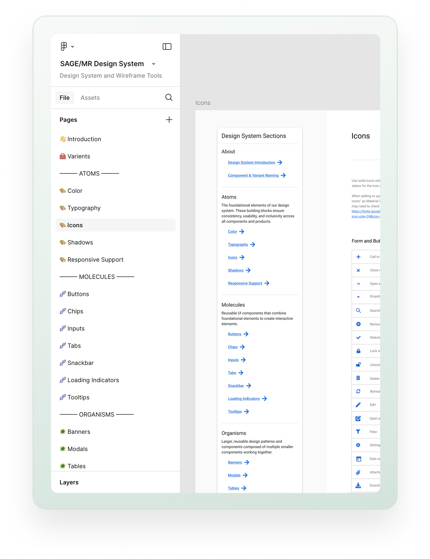
I made the design system easily accessible by housing the system in a centralized design repository and created easy to follow navigation and instructions to ensure all team members could quickly access the various sections in a large Figma library.
I gained quick leadership buy-in with strategic release of design and accessibility enhancements as well creating a multi-brand design system with defined goals that reflects leadership’s vision for a cohesive product suite.
Impact

The design system significantly improved both team efficiency and user experience.
For the UX & Product Teams
✔️ Reduced redundancy
UX team members can now quickly find and reuse patterns, instead of duplicating work.
✔️ Improved developer efficiency
Front-end engineers no longer need to maintain a separate component library for designers and business analysts to reference, reducing technical overhead.
✔️ Shared language
Business analysts, developers, and designers can now communicate seamlessly, improving story creation and refinement.
For End Users
✔️ Consistent, accessible UI
A cohesive design improved usability and accessibility across both products that required little change management.
✔️ Seamless product experience
Users transitioning between products no longer faced jarring UI differences.
Lessons Learned
Scope evolves over time
A design system is never “done.” It requires ongoing iteration to adapt to new needs and strategic thinking and collaboration on knowing when and how to evolve it.
Strategic adoption matters
A successful design system isn’t just about the styles, components, or structure—it’s about getting people to use it. By integrating changes incrementally into sprints, aligning with leadership’s vision, and taking a grass-roots approach in it's development, we all ensured long-term success together.
Scaling & Future-Proofing is critical
It’s important to design a system that adapts as the organization and products grow. I started small with just solving for "how do I not reinvent patterns we have?" to "what is the user experience across all of our products and how do we manage multiple brands?".
Final Thoughts
This experience reinforced my ability to think strategically, bridge product experiences, and collaborate across teams to drive impactful change. By transforming a simple pattern library into a scalable multi-brand design system, we not only improved product consistency but also empowered teams to work more efficiently and effectively.
© 2025 Stacey Berglind. All rights reserved.